Manteigas is changing its promotional image. “Butters – The heart of the Mountain” the new identity phrase. The brand was publicly presented on Saturday and, at the ceremony, Flávio Massano, president of the municipality, highlighted that this is a brand with more meaning and differentiation.
“We thought about how Manteigas could differentiate itself more within the spirit of nature destinations”. “Manteigas has the signature “Vale por Natureza”, but we have several municipalities in the country that sign the same way. We feel that it is no longer differentiating and Manteigas has to differentiate itself”, he stressed.
Flávio Massano recalls that the “Vale por Natureza” brand has existed since 2016/17, coming to the conclusion, after the good tourist performance of recent years, that it was “the time to change and invest in the way we talk to our citizens and with everyone who likes to visit and get to know Manteigas”, he highlighted.
The new image and slogan maintain “the focus on nature”, but contribute more than the previous “Vale por Natureza”, highlighted the mayor.
“This brand activation aims to take a step forward, we are not saying that what was done was bad, it was great, it served the Municipality’s objectives perfectly between 2017 and 2024, but now we are in another era. And this is the era we want to begin, showing a land that people want to know, visit, and also where they want to live”, he highlighted.
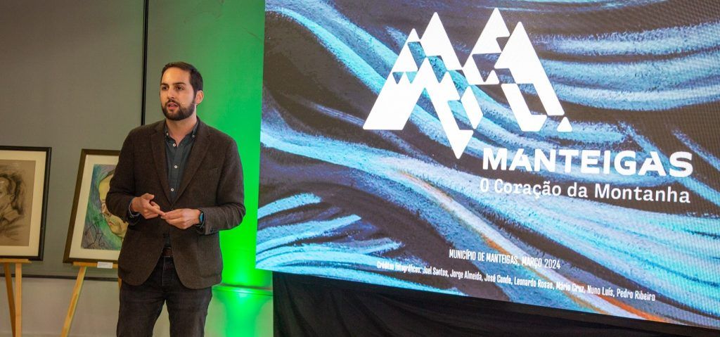
The image was created by the SP Creative team, which over the last few months has developed several collaborative workshops, with the population, to reach the final product.
As revealed by Ana Melo, the new image was built from what existed, “which was well done”, but which at this time proved to be “too generic” as it referred to nature and the valley, excluding the town and the community.
The new image also focuses on this emotional component, he explained.
“We want this entire communication strategy to be based largely on connection with the community and on everything we can build together.”
The image has the logo that refers to M de Manteigas, superimposed on iconic images that can change depending on the event, time of year, or what you want to communicate, highlighting the town and its houses that spread across the landscape.
“Because this brand is your identity, we wanted to take the strength from what is up there, which is Estrela, and give strength to what is down here, which is Manteigas”. “We look around and what we see is Manteigas inserted into the landscape and that is what we want to represent. You can see an M de Manteigas, but also the houses that go up over the Mountain”, explained Sandra Pinho, from SP Creative.
A strong symbol with character, considers the team responsible for the new graphic identity, which highlights its multiplicity and the fact that it focuses on the town and its community, concluding that in the new image the mountain is represented in symbiosis with the town of Butters.
Tags: Butters promotional brand
--


